Get Styling with Your New Logo

You’ve been through the process of getting your shiny new logo designed and it’s been applied to all the things you need to run your business.
It’s been distributed to key staff to use and everyone is excited, until you notice said staff have been using a plethora of different fonts and sometimes the logo appears fuzzy or the colour isn’t quite right. Maybe the icon has appeared without the tagline or the portrait version when landscape should have been used.
Next thing you know the business identity you invested so much time and money in is a complete mash up. There’s no visual consistency, the business’s visual identity has lost all impact and no longer reflects professionalism.
How did this happen? It’s mostly because not everyone realises how important brand consistency is, nor are there any guidelines how to achieve it.
How can you make sure it is reproduced correctly? With so many different people and processes involved, you need to make it simple.
Yes, demand perfection
What I mean by this is that your graphic designer has spent an inordinate amount of time choosing the exact colours, fonts and spacing as well as the creation of the visuals. Everything has been chosen for a reason, and you have signed off on an exact design. So, make sure when it is unleashed to the public things don’t go astray.
For example, you may advertise in your local paper or magazine, and sometimes the art dept. may ‘tweak’ things like colour, dimensions or even fonts to make things fit better for their purposes. They may not be huge things, but it will mean your brand is not reproduced perfectly, which is not acceptable.
Enter the Style Guide
A brand style guide is like a rulebook containing specifications on everything that plays a role in the look and feel of your brand - from typography and colour to logos and imagery. It lets everyone know exactly how to present your brand to the world wherever they are within the business, an outside freelancer or agency.
Consistency is key to any brand, you want it to be recognisable wherever it appears, after all, you’ve invested in that branding and that’s what you want it to look like EVERY time.
Small or large you should have style
Style Guides can be huge tomes of rules, for example, government departments take brand reproduction extremely seriously, and every possibility is logged. I’m not suggesting this is appropriate for every business however, even a small business will benefit from having a simple style guide.
A simple style guide documenting colours, fonts and logo variations together with the specified minimum amount of white space surrounding each logo
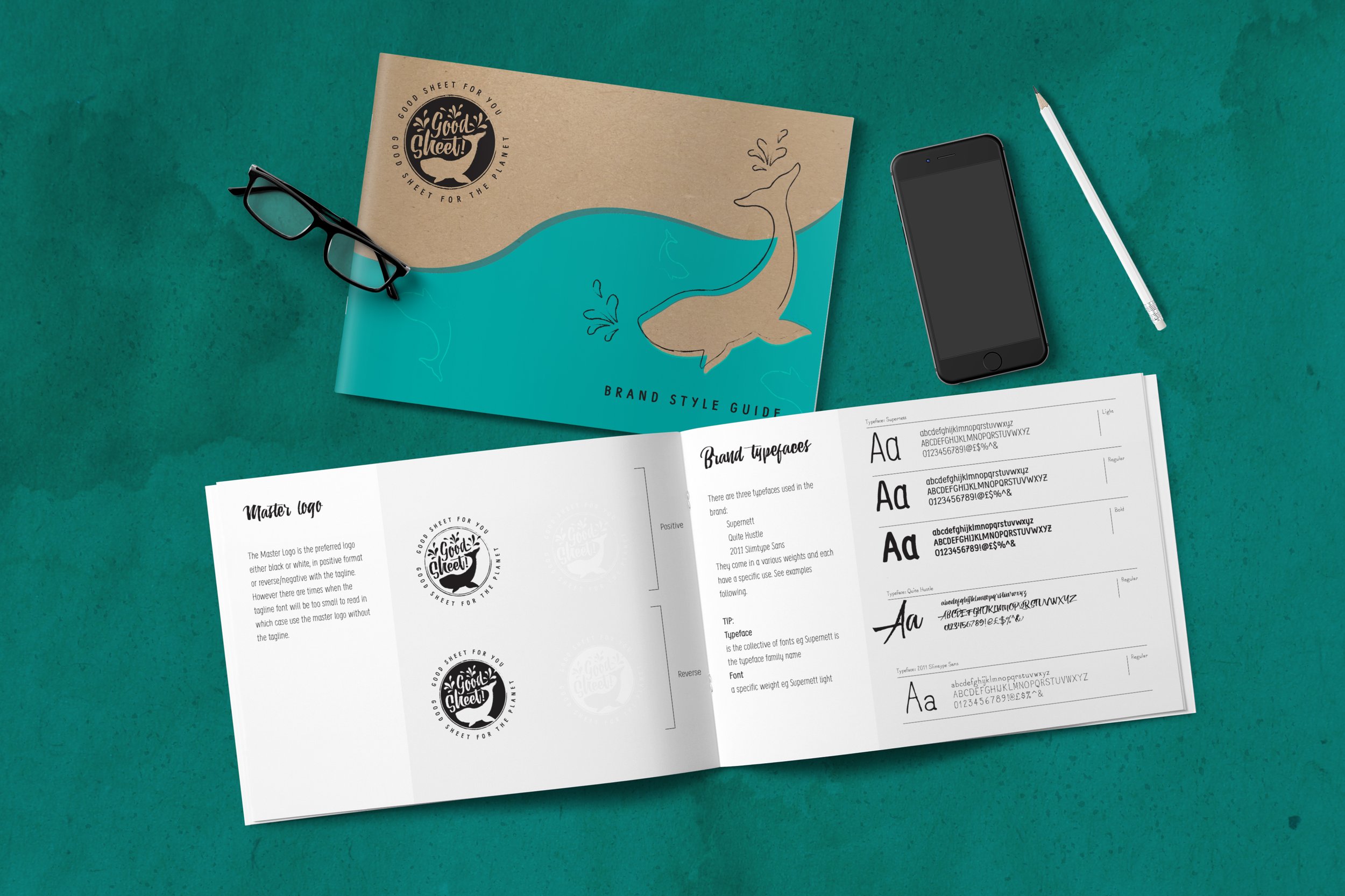
This is a more extensive style guide including colour palette, fonts, font usage, logo and logo asset directory. You can see the full guide here.
This link shows a set up for a very extensive style guide to be used with all the visual elements listed and the different ways it can be represented. Full colour, mono (that’s black and white to us), with a tag line, without a tag line, with the tree, without the tree. A horizontal version (wide) and a stacked vertical version (tall). All the options are covered so that when material is being prepared by staff or external designers, they can see which designs have been authorised to be used in which situations.
It’s simple and effective and worth the extra investment. All good designers will offer a package that includes a style guide option when branding. Now you know what it is, give it some serious consideration to ensure your brand looks perfect everywhere and every time.