therese toohey
logo | brochures | templates | stationery | art direction
the brief:
I have had the pleasure to work with Therese Toohey in the past, so when she returned with a new design gig, I was excited.
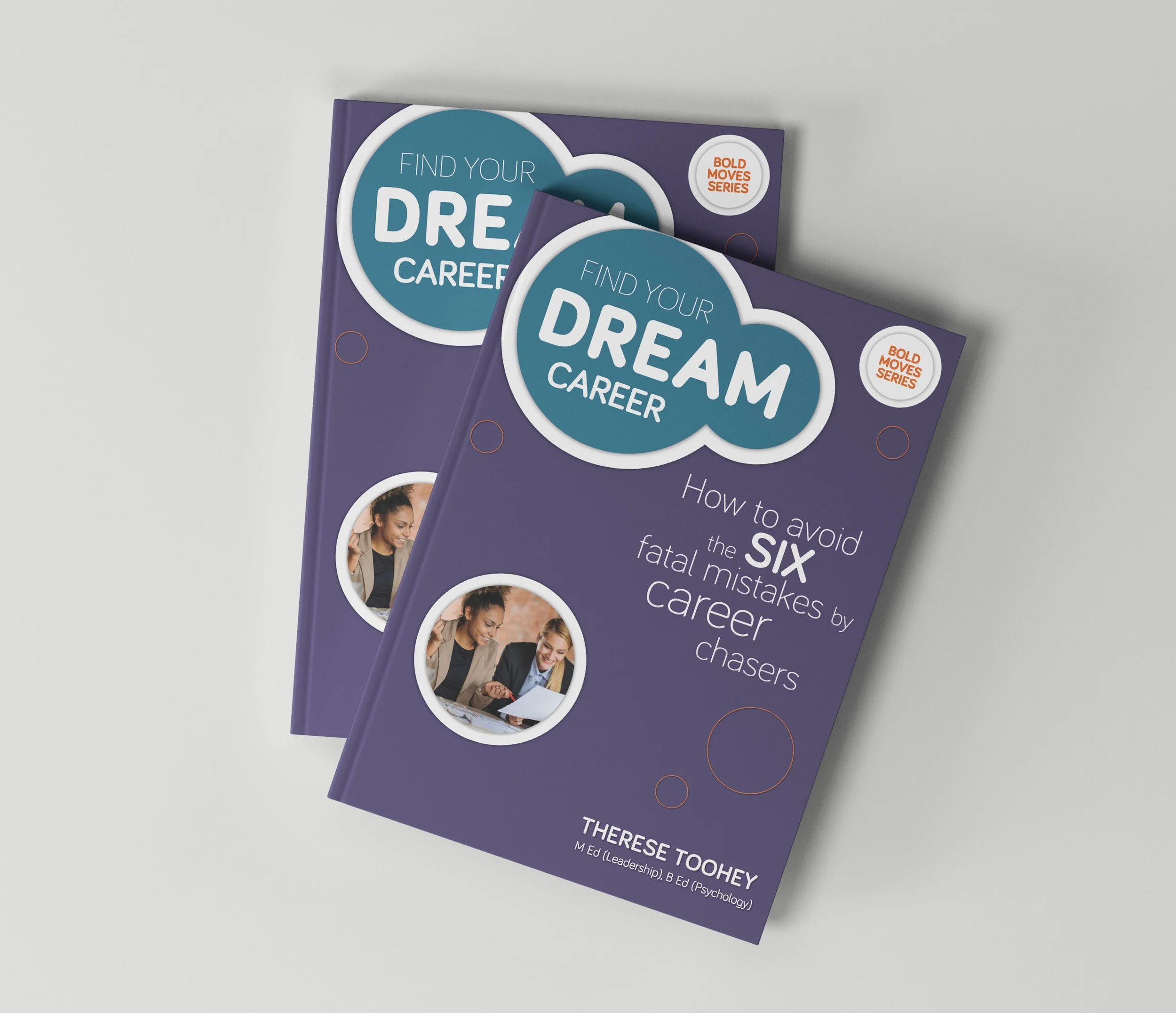
The gig was a bunch of collateral - work book, flyer and a slide deck. But there was one glitch - the logo.
Having a thorough background knowledge of what Therese does (helping professionals to find career freedom) I felt the existing logo didn’t really convey that. So I gave my graphic design opinion which resulted in a redesign being added to the brief.
The Solution:
Using the existing colours and font with the addition of Therese’s own handwriting, I created a design that expressed her personality and specialty. Her initials TT, with the addition of a couple of circles, revealed a stick figure couple dancing, arm in arm. Perfect. It spoke freedom, joy, partnership, support, togetherness... nailing exactly what she offers in her work.
Marketing Collateral:
Logo
Brochures
booklets
slide presentation decks
video graphics
art direction
The Result:
With pm3 you get an honest appraisal of what you have and what you could have. In this case, a brand spanking new conceptual logo that fits perfectly into the professional and corporate worlds while conveying fun, freedom and breaking barriers.
The existing logo at right, lacked movement, personality and concept.


