Byron networking group
logo | branding | social media graphics
the brief:
The group required a design that would appeal to a broad audience of businesses, professions, genders and age groups. The members also felt the design should visually reflect the elements of networking and the Byron Shire region.
The Solution:
Working with the group acronym, BNG, we created an icon that can work both independently of the name and collectively. The design is an organic abstraction of the letters and overlapping them conveys interconnection, suggesting the essence of networking.
The colour palette is made up of three warm, bright yet earthy colours which are a playful representation of the Byron surrounds of sea, sunsets and rainforests.
Marketing Collateral:
logo
business card
social media graphics
pull-up banner
website graphics
The Result:
A recognisable logo design that reflects both business networking professionalism and a Byron style. The client felt perfectly encapsulated the business group ethos.

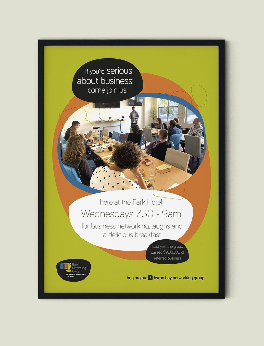
Poster ad

Social meme

Social meme

Social meme

Social meme